Pigeon
Package Design • Web Design
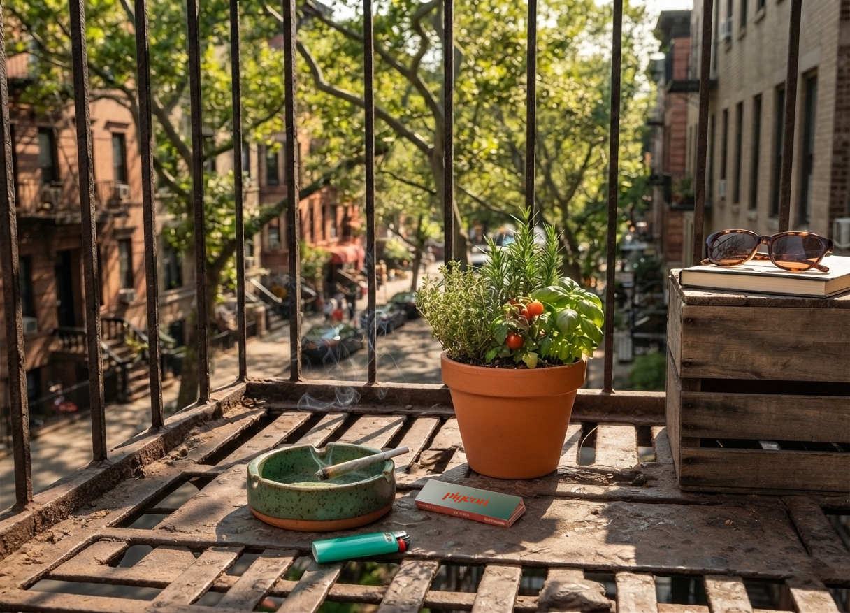
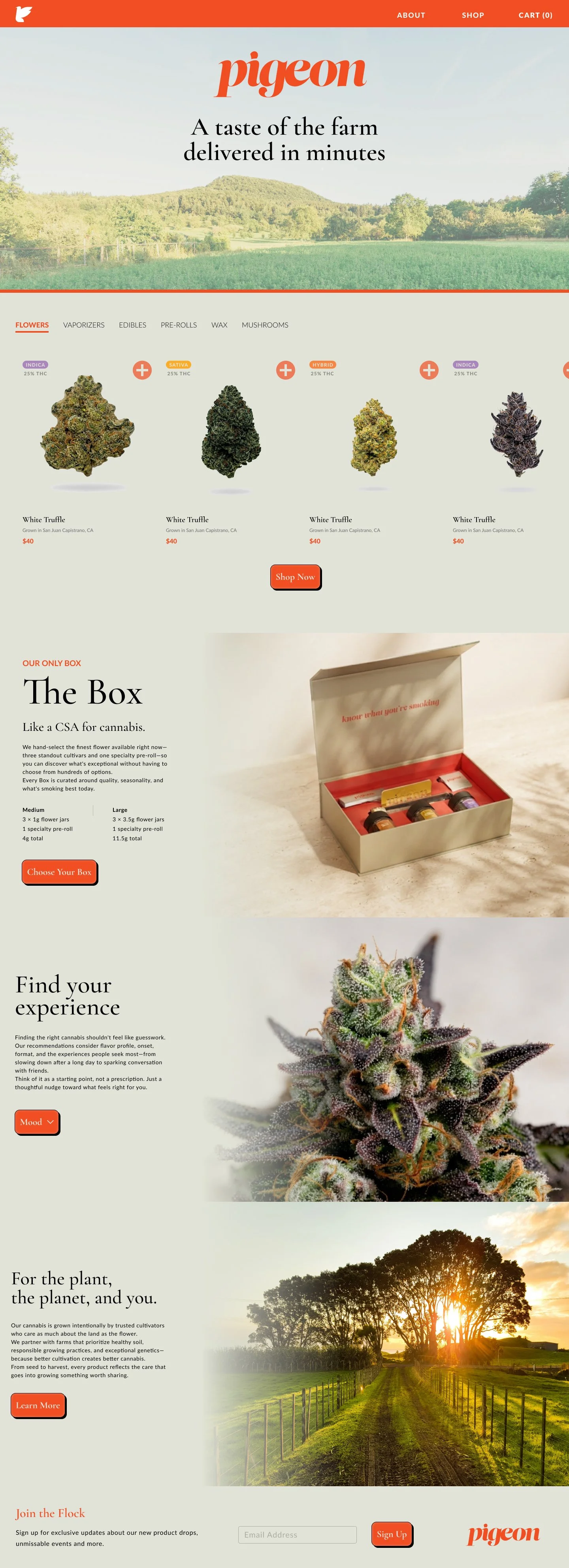
Pigeon is a direct-to-consumer cannabis brand built around a simple premise: farm-to-table product, delivered to your NYC doorstep. All cannabis is sourced from Pigeon’s own farm in California or from farms within their collective. The brand’s name pulls double duty — a reference to the carrier pigeon as delivery mechanism and to the pigeon as a New York City icon.
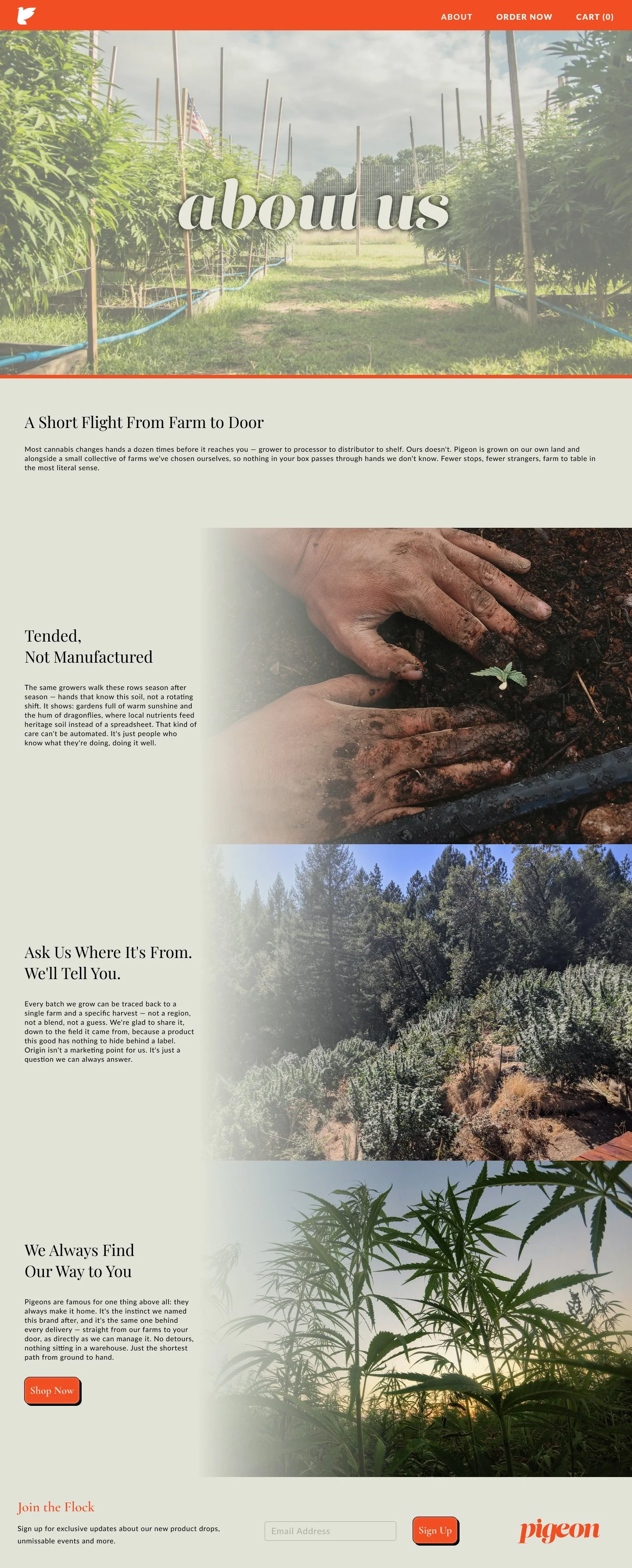
I joined the project with a brand guide in hand and was tasked with taking the brand online for the first time. Working with a developer and a small team, I designed the website, translating the existing brand colors and typography into a digital experience and establishing how the brand would present itself publicly for the first time.
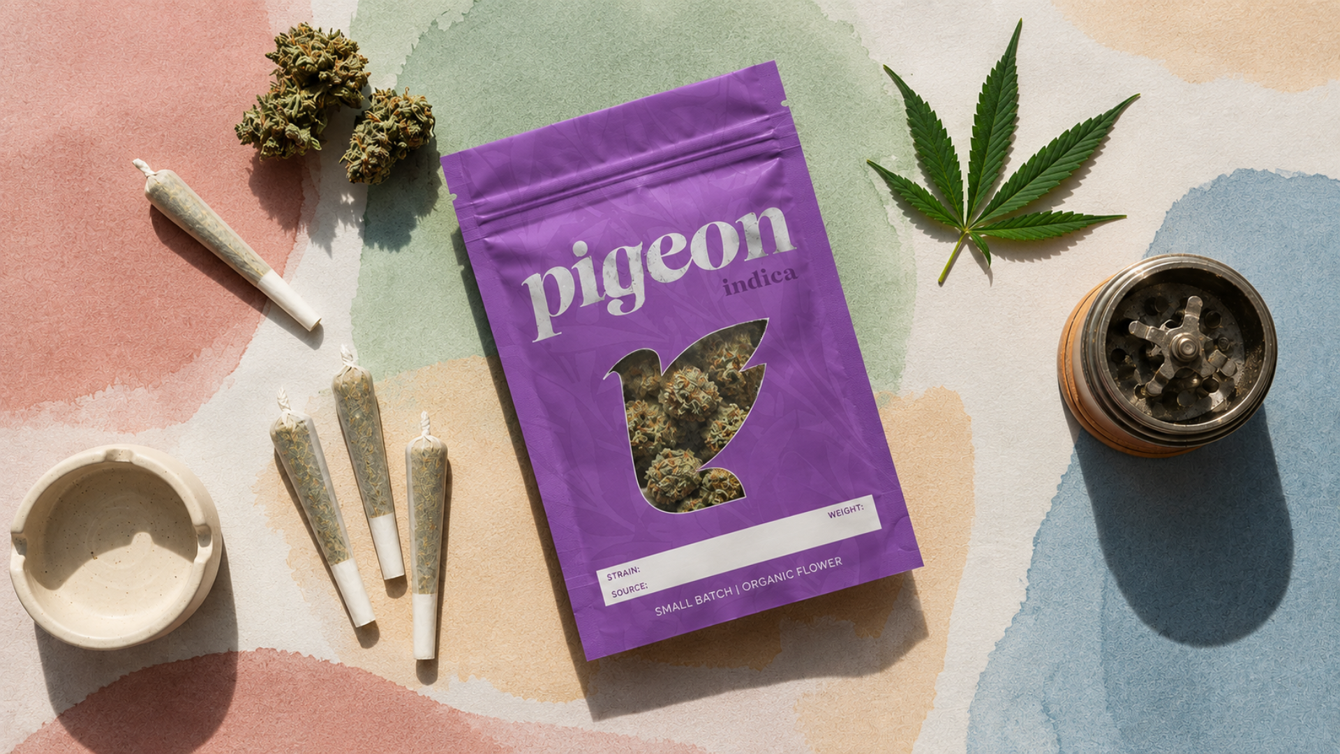
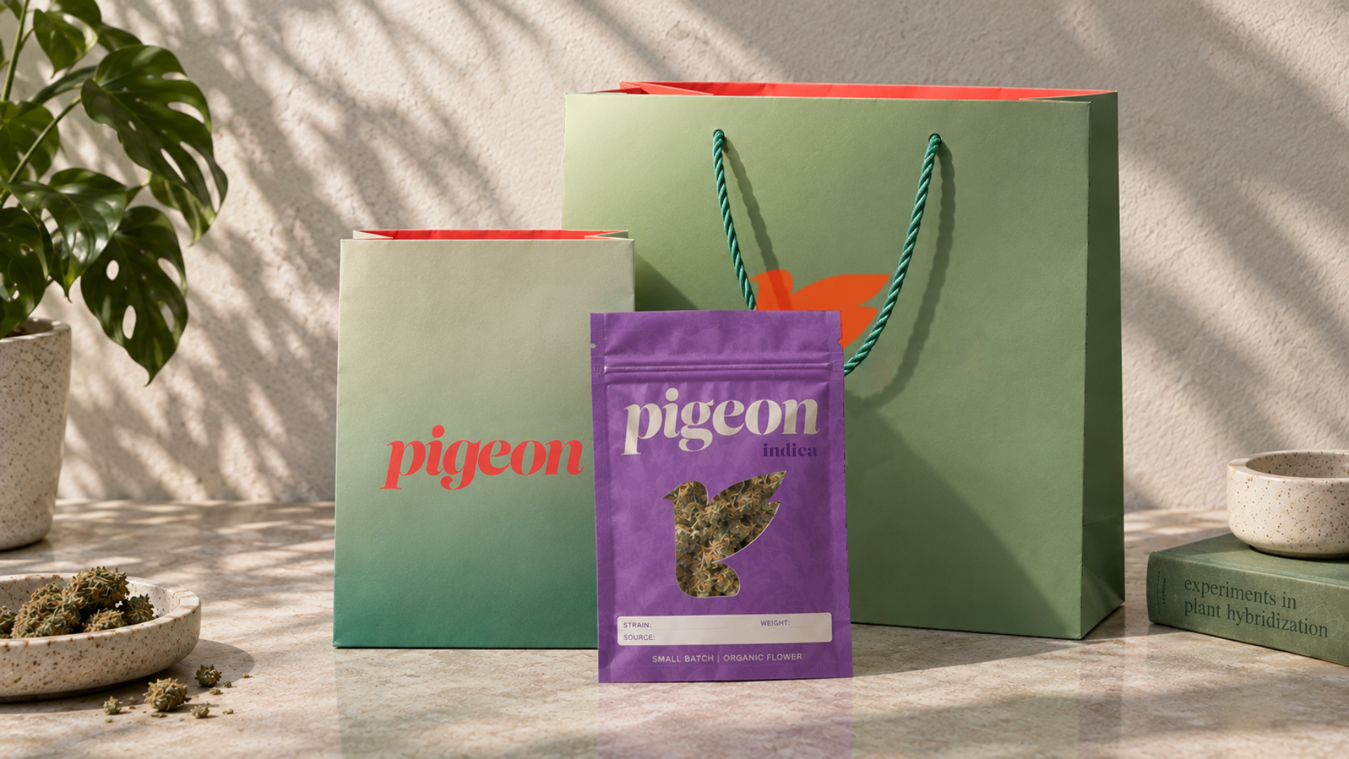
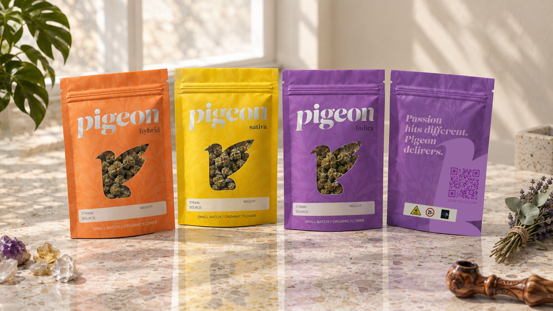
The central design challenge was packaging. Cannabis branding has a well-worn visual vocabulary — psychedelic colors, heavy-handed leaf imagery, counterculture references — and Pigeon wanted none of it. The brief was a luxury experience: high-end, restrained, and communicative of product quality rather than category. I designed three mylar bags for the product line, each in a different colorway to distinguish strain category (indica, sativa, and hybrid), and two shopping bags in different sizes. The color differentiation gives the line a coherent system while still making the category legible at a glance.
Customers responded positively to the new packaging, which helped reinforce the brand’s positioning as a luxury experience. The website is set to launch soon.