
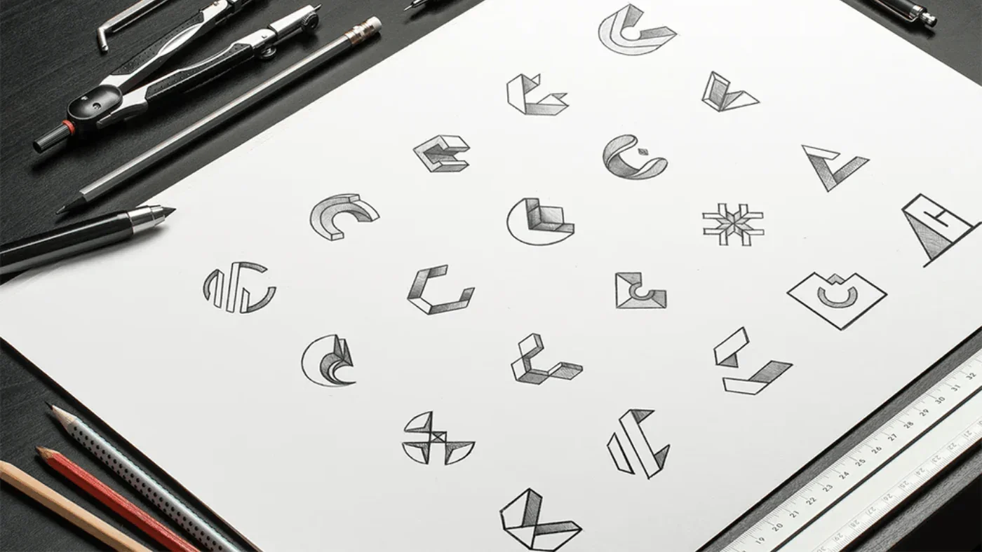
Freelance Logos
Logos • Branding
Various logos I’ve designed for freelance work.
Homeostasis is a company that synthesizes battery-grade graphite from atmospheric CO2.
I used muted natural tones to suggest the environmentally friendly nature of this company.
Homeostasis refers to a self-regulating process that adjusts to maintain stability. “Balanced, but in motion” was the idea behind this logo.
The design was inspired by ripples in a pond – waves radiating and eventually resting at equilibrium. The sine wave across the middle of the logo is a self-correcting function that repeats infinitely. It lends the company a “tech” feel, which is appropriate, considering the cutting-edge technology used to extract CO2.
Homeostasis Logo
Brand identity for an AR platform. The mark abstracts three overlapping eyes in the CMYK primaries, with a colored drop shadow that mirrors the product’s kinetic energy.
Kaleidoco
Personal logo for a copywriter. I found a script typeface that read as hand-lettered rather than decorative and broke the lowercase g out of its containing circle to add dynamism.
Kristen Gaerlan
